The 2022/23 Premiership Shirts, Ranked
- anchristie89
- Apr 25, 2023
- 6 min read
Updated: Jun 24, 2023
*this article was originally posted on miseryhunters.co.uk
It’s the best time of the year. Grubby little fingers excitedly smash away at group chats, sharing the latest news. “This one’s nice.” “Why’ve they put a collar on that one?” “Andrew, sharing pictures of Venezia shirts doesn’t count as a personality”.
As of this week, all twelve Scottish Premiership clubs have now launched their kits for the upcoming season
So, let’s do it! Here (in reverse order) are the 2022/23 Scottish Premiership shirts, RANKED.
12. St Johnstone


The blue of the home kit is clean and the design simple. The embossed geometric design will be quite cool in the flesh, I imagine. A very tame attempt at a retro feel from Macron here, though.
You can see what they’ve tried to do – aiming for no frills, landing on no fun.
St Johnstone!
That away kit though. Wooft.
Inspired by their fan-favourite 1996-98 kit, the Perth Saints have brought back the magenta and teal.
Magenta and Teal - sounding less like a winning combination of football colours and more like an ITV daytime crime-drama that has somehow been running for 20 years despite no one ever having watched a single episode.
I say this without hyperbole: this might be the worst kit in SPFL history.
Home – 3/10 Away – 0/10 Total – 3/20
11. Kilmarnock


Killie return to the big time after a jaunt around the Championship, and it's nice to see they have the same "let's take this insanely cool and fun thing and make it boring af" attitude towards the Hummel brand as they do to the game of football itself.
The collar on the home kit is quite nice?
Their bus seat third kit is a screamer though. Look that up.
Just really gutted they're back in the league, tbh.
Home – 3/10 Away – 3/10 Total – 6/20
10. Ross County


The sort of, broken, alternating… hoop… thing happening on Ross County’s home shirt is quite interesting, but slightly lacking in any real identity.
The subtle pattern on the all-white away shirt is a neat touch. But ultimately a bit of a swing and a miss from the Staggies on both counts.
Home – 4/10 Away – 3/10 Total – 7/20
9. Livingston


A throwback to the early 2000s, when behemoths of the “great to hear the name” game such as David Fernandez and Quino Cabrera roamed the earth.
Livi tend to flit between black and yellow as their primary colour for their home shirt, and this year’s yellow Joma effort is a major return to form for the West Lothian side.
The retro collar gives the kit a timeless feel. And is coincidentally perfectly designed to be turned up in order to hide the redness of your neck as you try to pass off the same PES kit creator away kit that you’ve had for years now as new.
Come on, guys.
Home – 7/10 Away – 3/10 Total 10/20
8. Rangers


The retro-inspired checkerboard of the home shirt is a very classy touch, and the thin red stripe down the sides is a nice nod to the 2002/03 SPL winning team. Last year’s home kit was a very hard act to follow, but not a bad effort at all, this one.
Taking inspiration from away shirt glories of the past, Rangers’ 22/23 effort gives it a good go but ultimately falls short of anything remarkable.
And the less said about the A4 size BOXT sleeve logo on both kits, the better.
Home – 7/10 Away – 4/10 Total – 11/20
7. Hibs


Very mid-noughties that home kit. Ivan Sproule. Derek Riordan. Guillaume Beuzelin. These names doing anything for you? The shirt certainly isn’t.
The away kit is a bit more like it. The subtle cabbage pantone (incredibly funny to me that a designer had to say this in a pitch meeting) is lovingly crafted and utterly unique; the story behind it is a nice way of shouting out the club’s history. Matching the black and white badge to the trim of the collar and neck is a lovely touch as well.
A cool kit indeed.
Home – 5/10 Away – 7/10 Total – 12/20
6. Dundee Utd


“The home kit posits the suggestion that art and commerce are, at their core, irreconcilable”, your boyfriend says before taking a long drag of his watermelon geek bar and coughing something stupid about Steven Fletcher being a 20+ goal a season striker. It’s time to phone him a taxi.
He has a point though. The recreation of Utd’s 1982-83 league-winning kit is one dodgy sponsor away from being a potential all-timer. The Macron badges down the arms send it straight to the top of the Will Look Class in Long Sleeve rankings.
Black kits are always classy, and the diamond pattern on Utd’s away shirt adds a nice depth to the colourway. Overall though, it just lacks a bit of feeling. Still, less clumsy negative space on the badge, eh?
Home – 9/10 Away – 5/10 Total – 14/20
5. Celtic


Pour yourself a lovely big glass of CR Smith and let’s have a remember.
We’re nodding at 1988. We’re passing through 1993. We’re going like that “alright?” to 1997. The glory days are back, baby.
The darker geometric pattern of Celtic’s home shirt is an exciting addition atop the classic green hoops.
I do love that the hoops continue on the back of the shirt too, as it’s the kind of thing I’d have a massive (bumble)bee (kit) in my bonnet about if I were a Celtic fan.
The away kit - an update on a classic look from ’92 – incorporates pinstripe-style design in classic black, green and white. The shield style embroidered crest around the badge adds to the feel of a kit we’ll likely be seeing worn around the East End of Glasgow for many years to come.
Home – 8/10 Away – 8/10 Total – 16/20
4. Aberdeen


Usually quite coy about being Good In The Eighties Mate, Aberdeen have allowed themselves a bit of bluster, marking the 40th anniversary of their European Cup Winners’ Cup Final victory of 1983 with a pair of cracking new kits.
The home shirt features the iconic white pinstripe design, synonymous with that night in Gothenburg. Sleek, clean and with that neat retro finish, the home kit is a stellar effort from a club who have seemed to be going through the motions kit-wise, in recent years.
The white away kit – also a nod not to that momentous 82/83 season - mirrors the home, with the addition of red underarm panelling giving that little extra touch.
Two top efforts from The Dons, here.
Home – 9/10 Away – 8/10 Season - 17/20
3. Motherwell


The claret and amber colourway is one of Scottish football’s most iconic designs.
This recreation of Motherwell's fan-favourite 1982-84 kit is an absolute stormer. The subtle pattern at the point where the two colours meet is the jewel in the crown of a kit that wonderfully melds history with modernity.
The away kit is an incredibly strong showing as well. The sponsor being shrunk down to fit the stripe in particular makes the shirt shine. A rare example of a design team making the aesthetic limitations of a sponsor work for them rather than against.
Two very strong efforts. Well done.
Home – 9/10 Away – 9/10 Total – 18/20
2. St Mirren


Aw mate. Aw mate, aw mate. St Mirren have absolutely smashed it this year, both in terms of the kits themselves and in how they were launched.
Both are steeped in hometown heritage. The classic black-and-white stripe design is elevated through the subtlety of the sublimated Paisley pattern through the white and accented with the pop of red from the collar and cuffs. The kit is Paisley through and through, as outlined by the choice to stage the launch in front of the Anchor Mill.
Launched with help from lifelong Buddies fan Ewan McVicar, the blackout Paisley pattern kit sent St Mirren Twitter into meltdown on release day.
And rightfully so. The shirt is a stunning look, laying the iconic pattern over a sharp, black base; the flash of red on the monochrome badge the only colour on the shirt.
A genuine modern classic.
Home – 9/10 Away – 10/10 Total - 19/20
1. Hearts


Look, football kits are easy. They are. A nice simple home shirt in your club’s colours and an anything-goes mad bastard of an away kit. That’s all there is to it, and it is a brief that Umbro and Hearts have knocked out of park.
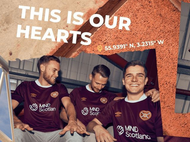
The textured ottoman fabric of the home kit gives the kit an inventive, yet casual feel. Matching the gold of the Umbro logo and bespoke heart of the sleeve/back of the neck to the trim of the Hearts crest is the cherry on top of the best home shirt of the year.
The away shirt takes inspiration from the famous cobbled streets of Edinburgh; adorned with a playful polka dot aesthetic. The Umbro design also features a stylised crew neck and is finished off with classy maroon cuffs.
Beautiful.
Home – 10/10 Away – 10/10 Total - 20/20
And there we have it. A comprehensive and undebatable ranking of all Premiership home and away shirts. I will now resume my regularly scheduled programming of despising 11 out of those 12 teams. ALRIGHT BYE.


Comments