The 2023/24 Premiership Shirts, Ranked
- anchristie89
- Feb 26, 2025
- 7 min read
No matter how old I get, football kit season is always the most exciting time of the year.
With the cyclical nature of fashion and a footballing obsession with all things retro, I once again find myself stood outside the cinch like a (somehow even creepier) Matthew McConaughey in Dazed and Confused.
So, here (in reverse order) are the 2023/24 Scottish Premiership shirts, RANKED.
Ross County
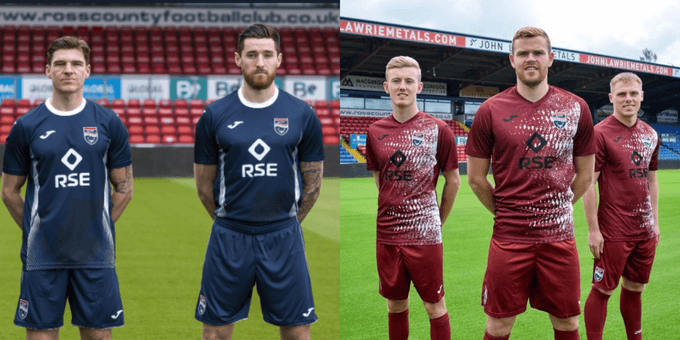
Home - 5/10
Joma and Ross County’s brief of “maintaining the link between our past, present and future” is certainly met with this shirt. You've seen it before, you're seeing it now and you'll see it over and over again. Time is a flat circle and The Staggies are laughing at you.
The subtly underlaid graphic of the highlands is a nice touch, but overall an uninspired, forgettable effort from the Dingwall club.
Away - 1/10
Word has it the hex code for that brown came from a sound that Uncle Roy made when he woke up from that dream where all your teeth fall out and you have to do PE in your pants.
Hideous and I hate it, cheers.
Overall - 6/20
Celtic
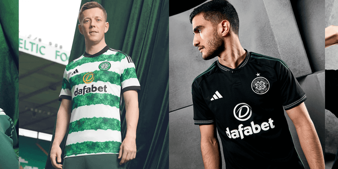
Home - 1/10
Aw man. Just a mess, isn’t it? a few half-baked ideas shoved together to form one incredibly disjointed, borderline unsettling design.
The iconic hoops are reimagined into a nod to the stained glass pattern of the original entrance to Celtic Park, but undermined by clunky, focus-stealing black detailing on the collar, cuffs and sleeves.
A kit that tries everything and achieves nothing. Get rid.
Away - 6/10
The well of black away kits is one that Celtic have typically found great joy in, and this Adidas effort is no different.
Tartan accents on the (disappointingly henley) collar and cuffs lend a touch of class to what could otherwise be an overly austere shirt. I like it.
Overall - 7/20
Livingston

Home - 4/10
Once again, West Lothian Yellow have broken out of the PES Kit Creator Studio to cause havoc inside my head. You can see what they’re going for here, but after producing the home shirt of the season last time out, this feels like a real letdown.
Away - 4/10
In terms of their online presence, Livingston are pretty consistently bang on; their social media content, in particular, is amongst the best in the country. The launch videos for both kits this season are testament to that - forward-facing yet aware of their roots, ensuring that the community is at the heart of everything. But all the media nous can’t escape the fact that the design of this away shirt is jarring, and ultimately lacking in any real personality.
The yellow chevrons are matched in the sublimated black front panel of the shirt, elevating the shirt on a second, closer glance. But aye, I dunno, it’s not really anything, is it?
Overall - 8/20
St Johnstone

Home - 4/10
Despite being marketed as a tribute to the 1982 First Division winning St Johnstone side, there is precious little about this shirt that screams 80s. This Macron effort is an example of an overly forced narrative, with the Perth side clumsily fumbling the retro bag with no real imagination or thought.
Away - 5/10
Not unlike St Johnstone on the pitch, this shirt achieves passable results without turning too many heads in the process.
Strong colouring and striking visuals keep the identity of the Saints alive, with the yellow of the collar and cuffs adding to a well-rounded, if slightly boring end product.
Overall - 9/20
Rangers

Home - 8/10
The repeat jacquard pattern of this Rangers home shirt gives it a quality that has until now alluded manufacturer Castore.
The kit is a masterclass in subtlety, the pattern of the body being accented perfectly by the red and white collar.
A really strong effort, this.
Away - 3/10
This kit is starting a conversation with someone about prestige TV and asking them their favourite episode of the news. I won’t expand on that.
Overall - 11/20
Aberdeen

Home - 3/10
Aberdeen mark their 120th anniversary with “a nod to the black & gold jerseys which were worn during the club’s early years”.
That’s one way of looking at it. Another might be that a poor creative team was tasked with slapping an after-the-fact narrative onto a months long design process of Dave Cormack screaming American words around an empty Pittodrie. Very gaudy. Very grim.
Away - 8/10
Now this is more like it.
Drawing inspiration from Dons pre-match anthem “The Northern Lights of Old Aberdeen”, this Adidas shirt features cosmic, asymmetrical pink/mint swirls on a black base. Vibrant, mesmerising, and as unmissable as the “heavenly dancers in the sky” the shirt is based on.
Overall - 11/20
Hearts
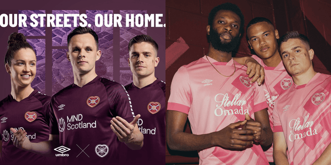
Home - 5/10
Hearts and Umbro has been one of football’s most impressive collaborations of recent years, leading the way in clean, simple designs.
Taking inspiration from the Heart of Midlothian on Edinburgh’s Royal Mile, 2023/24’s home shirt incorporates the world-renowned mosaic through a striking sleeve graphic.
Ultimately though it feels a bit… empty. Unfinished almost.
Despite a cool story around the sleeve design, the shirt as a whole feels a bit devoid of feeling. A rare swing and a miss from the Gorgie outfit.
Away - 7/10
A modern reimagining of the side’s famous 1993/94 home kit, Hearts’ new Umbro away jersey has been updated through an injection of colour and vibrancy and… pink! The end product is an exciting, forward-thinking portrayal of a classic that pays homage to what came before. Brave. Bold. Belter.
Overall - 12/20
Dundee

Home - 8/10
Unveiled back in March as part of the Tartan Exhibition at Dundee’s V&A museum, this shirt is a lesson in keeping things simple without being dull.
The 2023/34 Macron home shirt is embossed with the zig-zag pattern that adorns the exterior of the aforementioned museum, the modernity of which is accented with timeless gold and grey tartan. An excellent representation of a city on the up.
It’s also the kit that I reckon will look the nicest in long sleeve. So, well done.
Away - 5/10
“Dundee till eh deh.”
Limmy gif. You know the one.
Overall - 12/20
Kilmarnock
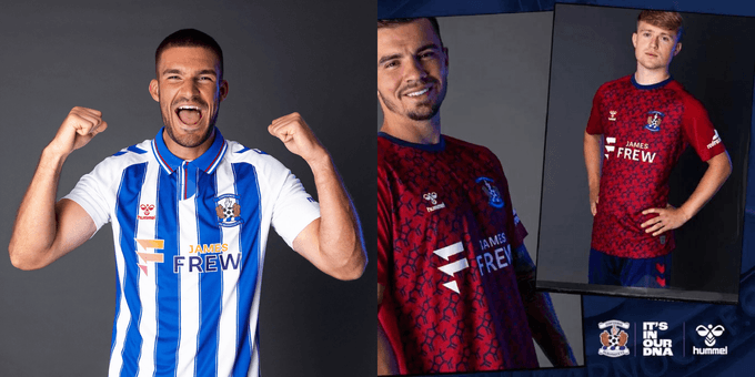
Home - 7/10
Since partnering with Hummel in 2020, Kilmarnock have failed to hit the heights associated with the work of the Danish sporting icons. You have to say though, they’ve pulled it out of the bag a bit this year with this classy home jersey.
A nod to the fan-favourite AT Mays era of the 1990s, iconic blue and white stripes are elevated by a stunning red accented button-down collar.
A cynic might say the shirt is let down by a solid white back (it’s me, I’m the cynic), but a very solid effort from the Ayrshire side nonetheless.
Away - 9/10
This shirt is everything you want an away kit to be, expertly combining striking visual appeal with a celebration of the club and its surrounding community.
The pattern of the jersey incorporates the visual essence of penicillin, first discovered by Killie boi Sir Alexander Fleming in 1928
A brilliant example of narrative not just existing alongside, but elevating design. Just lovely.
Overall - 16/20
Hibs
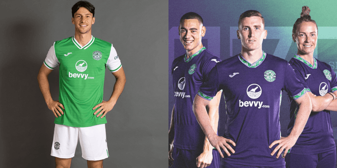
Home - 6/10
Hibs, Bevvy, make that font slightly smaller and that image slightly larger and we're cooking with gas. Right now, all we're cooking with is a whisky sauce that you’ve totally messed up after turning the Youtube tutorial off halfway through because the boy in it kept saying “mouthfeel”.
Away - 10/10
Shrewd use of trim colours can make a shirt. The Aztec detailing on the collar, cuffs and trim of this 1990s-inspired away kit is sublime. As with the home shirt, a sublimated striped pattern elevates the design in a subtle yet classy way. The best kit of the year.
Overall - 16/20
St Mirren

Home - 9/10
This shirt is the clear winner of this year's Attention to Detail Real Quiz Trophy.
Saints’ first Macron home shirt nods to the club’s historic time period of 1979-81, during which the Paisley side triumphed in the Anglo-Scottish Cup, as well as playing their first ever match in Europe.
The standout feature of the shirt is its chequered design, paying homage to the Royal Stewart family who founded the Paisley Abbey in 1163. A repeated Macron logo runs down the sleeve, giving the kit a feeling of being simultaneously nostalgic and forward facing. The shirt does an expert job of presenting St Mirren, and Paisley, as it was, as it is and as it could be.
If next season we could maybe be nostalgic about me not being able to pull off a v-neck though that would be great?
Away - 8/10
It’s me dressed as the Steve Buscemi how do you do, fellow kids? meme going like that “Barbenheimer”.
Saints’ away shirt is a mix of the club’s colours of black, white and red incorporating the men’s, women’s and academy squads.
The striking pink visuals play well against the chequered pattern of the black to produce a vibrant, exciting end shirt that carries with it an important message of togetherness.
Overall - 17/10
Motherwell

Home - 9/10
With one of Scottish football’s most iconic colourways at their disposal, Motherwell have turned simplicity into an art form.
This Macron home shirt is no different.
After a break from tradition last season, the iconic claret hoop returns to the middle of the shirt (and continues on the back, which matters) and is matched by the collar and cuff. The subtle amber box pattern juxtaposes this expertly, resulting in a shirt that feels both lived-in and modern.
I’m always reluctant to judge a shirt based on its sponsor, but we’re a couple of font sizes away from the perfect shirt, here.
Away - 9/10
This jersey is a contemporary take on the club’s famous 1970s look.
A solid base of claret is split by an eye-catching sash of white accented amber (also mirrored on the cuffs).
The button-down collar acts as The Dude’s Rug of the piece, tying together a shirt that is as simple as it is effective.
Good job.
Overall - 18/20
And there we have it, the definitive ranking of the Scottish Premiership 2023/24 shirts. Follow me on Twitter @thatAndrewC for more of This Sort of Thing. OKAY BYE.


Comments