The 2024/25 Scottish Premiership Shirts, Ranked
- anchristie89
- Feb 26, 2025
- 6 min read

Well, here we are then. Season 2024/25. The unstable air of the international summer has passed, and our attention once again turns closer to home. Club football. The highs. The lows. The kits. THE KITS. The most anticipated fixture of all: What You Do vs How Good You Look Doing It. Only one winner for me.
Before we start this list of home and away jerseys only, honourable mention must go to Hibs’ third kit, Dundee’s pre-match shirt and Hearts’ goalkeeper jersey.
Right, let’s get after it.
12. St Johnstone

Home - 3/10
A real lack of design elements to focus on with this home shirt. The gold accents on the neck, badges and cuff pop nicely against the royal blue ghost striping, but not enough to catch the eye in any meaningful way.
Away – 0/10
Not only does it not work, it doesn't make any sense. We are all worse off for this having happened. I really mean that.
Total – 3/20
11. Motherwell

Home 3/10
The amber and maroon of Motherwell is one of Scottish football’s most iconic colourways, but this 2024/25 home effort is a rare swing and a miss from the North Lanarkshire club. Clean lines and a smart ringer collar can’t save this odd little guy from what might have been.
Away 2/10
Imagine running a marathon behind a guy in big jeans. Huge mosher bastards full of loose change, keys and CeX tokens. Think of the noise. All jingles, chaffing and chaos.
Watching Motherwell run around for 90 minutes in this is the visual equivalent of that.
Hate it, cheers.
Overall 5/20
10. Rangers

Home 4/10
Rangers’ home shirt calls back to the treble-winning season of 2002/03. Simpler times. Memories of an NTL home digital world. Bert Konterman was there. Jérôme Bonnissel too. Christian Nerlinger? These names doing anything for you? Because the shirt sure isn’t.
The tonal blue base features a diagonal print that reflects the structural architecture of the Ibrox Main Stand as the stadium approaches its 125th year - but that representation is broad at best.
An all-round fine, if largely forgettable effort.
Away 5/10
With garish patterns so prevalent in the football kit market in recent years, there is more space than ever for subtle, subliminal patterns like this effort.
However, the grey motif is arguably a little too subtle for its own good and the shirt fails to capture the attention on the whole.
Overall 9/20
9. Ross County

Home 5/10
Ross County’s 30th-anniversary home shirt is a minimalist throwback. The red of the collar and cuffs gives the shirt a strong, traditional look. Pretty clean. Pretty Impressive.
Away 4/10
The striking red base and the striping on the sleeves are interesting ideas that win the shirt points, but it feels too much like:
A) A rugby top.
B) Me having to expunge the phrase “tossing the pill around Dingers” from my head.
Not a fan.
Overall 9/20
8. Hibs

Home - 5/10
That third lunchtime pint of Deuchars is starting to taste like slapping a slightly new neck on last year's and getting another round in, isn’t it?
Away - 5/10
This all-white away kit is sharp, clean and inoffensive. The embossed pattern on the body of the shirt gives it a classy feel, but overall it lacks the charisma to turn heads. It is, however, one of the few kits this season whose sponsor actually elevates the design. I like that logo and it looks good on a shirt, what do you want from me?
Overall - 10/20
7. Dundee Utd
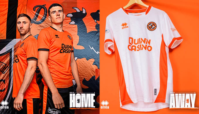
Home - 7/10
With Dundee Utd and Dunfermline already on their books, Italian manufacturer Erreà have been making interesting inroads into the Scottish game of late, their bespoke work drawing fans far and wide.
This Dundee Utd home shirt is elegant and simple, embellished with black trim around the crew neck and sleeves, the latter characterised by an alluring in-tone diamond pattern.
Very nice, lads. Expect big things from Erreà in the coming seasons.
Away - 6/10
With a crisp white body and tangerine trim, this is a shirt that demands closer inspection. Stylish sublimated geometric pattern? Yes please. Alluring diamond-style motif on the cuff? Go on then.
A really strong effort.
Overall - 13/20
6. Celtic

Home - 7/10
A template lives or dies by its customisability, and the new Adidas template is alive and well with this striking Celtic home shirt.
This year's home shirt features the distinctive curved side panels of Adidas’ 2024 output, as well as a knot collar design which “represents the unity of the club's players and fans.”
Away 7/10
Green and yellow is a combination that comes together seamlessly, especially for Celtic who have found the design on some of their most iconic kits over the years.
Thoughtful colour grading and pattern work is paired with the astonishing needle drop of a Massive Auld Badge emblazoned on the chest.
Dead nice, both of these.
Overall - 14/20
5. Aberdeen

Home - 9/10
Just imagined some guys discussing "blokecore" in Aberdonian accents and gave myself heartburn.
It’s a beautiful shirt though. Inspired by the kit that carried Aberdeen FC to the cup double in 89/90, this Adidas effort displays a subtle chequered design. Details on the crewneck collar nod to Pittodrie Stadium's Merkland facade and a woven club crest completes a look full of football pride; the large text of the sponsor adding to the retro feel. Lovely.
Away - 6/10
This draws inspiration from Aberdeen’s early days when the team was known as "The Wasps" for their distinctive black and gold striped shirts. So, not only does it look cool, but there's a relevancy and meaning behind the design, too.
The diagonal pinstripes across the main template of the shirt are strong. Ornate without being over the top. A solid effort.
Overall - 15/20
4. Dundee

Home - 9/10
Central badge appreciators rise up. It’s time to eat. And the massive embossed watermark-style badge on this Dundee home shirt certainly gives us something to chew on. A stunning execution of simplicity and class.
Away - 7/20
Dundee have kept things relatively safe with their away kit - though that in no way diminishes the quality of the offering.
Sure, it may not be the most thrilling, the most innovative, even the most interesting, but it is, in general, a very decent shirt. With a sophisticated collar and clean finish. A very decent shirt indeed.
Overall - 16/20
3. St Mirren
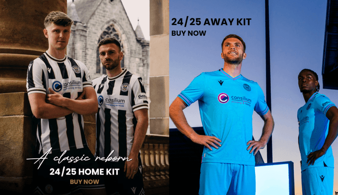
Home - 9/10
A person who has a problem with a humble black and white striped football shirt is a person who has a problem with life.
Manufacturer Macron describes St Mirren’s 2024/25 home kit as being “the symbiosis between a club and its community”, as shown by the launch set against the background of Paisley Town Hall. The shirt sees the famous stripes accented with slivers of gold and with a Paisley patterned fill. The black and gold motif is repeated on the collar and cuffs.
It's easy to slap a half-hearted narrative onto these things, especially where the tricky notion of “community” is concerned. Here we have a clear mission, laid out and met holistically.
A shirt bursting with thoughtful attention to detail and care.
Away - 9/10
Sometimes you want low-key and understated. Other times you want to look like the kind of thing James Cameron and his mates might fanny about with down that Abyss.
The cyan base of the kit maintains the embossed Paisley pattern synonymous with Saints’ output of late, resulting in a kit that feels St Mirren through and through. Love it.
Overall 18/20
2. Hearts
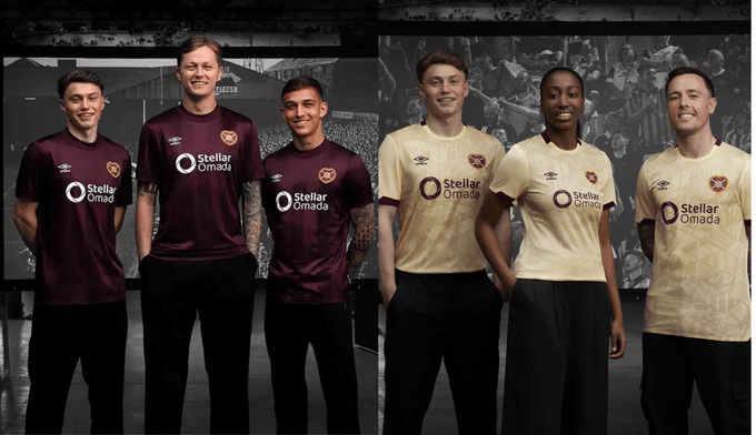
Home - 9/10
Hearts and Umbro have been one of the most iconic partnerships in modern Scottish football. This season sees another magnificent effort brought to the fore.
In the famous Maroon colourway, the shirt features a tonal striped design, a thick crewneck collar and a stylishness that echoes every inch of Archibald Leech’s famous Tynecastle architecture.
Away 10/10
This Hearts away shirt screams for your attention. It demands to be perceived. And perceive it we shall.
The shirt - a mosaic of previous shirt patterns - is a nod to what has been. It’s a nod to what’s to come. It’s a nod to me going like that “fair play” while sat in the corner of The Diggers trying to work out why my pint and my pie are the same temperature.
An outstanding display of club identity being presented in a visually distinct and interesting way. Class.
Overall 19/20
1. Kilmarnock
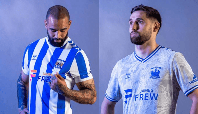
Home 10/10
This is it. This is the best one. Unbroken stripes, elegant white trim and a famous Hummel chevron to really scratch that itch right in your brain. Bloody hell, it’s nice.
Away 10/10
Killie continue their Hummel love affair with a nod to the club’s successes in the Ayrshire cup, a trophy the side first won 140 years ago. The body of the shirt is embossed with the thistle pattern that adorns the competition’s trophy - resulting in a shirt that feels both traditional, modern, and - above all else - very enjoyable to look at.
Overall 20/20
And there we have it. Irrefutable proof that the football on display in the 2024/25 Scottish Premiership will be, if nothing else, clothed.
Exciting stuff.
Right that’s me, BYE.


Comments